BIDDA was conceived as an innovative mobile app to modernize and streamline the asset auction process for businesses. The goal was to provide corporations a transparent, user-friendly platform to efficiently liquidate unused assets, either to employees privately or publicly.


Business Challenge: Businesses struggled with inefficient asset liquidation, often facing engagement and logistical issues. The app addresses these challenges by providing a streamlined, engaging platform for auctions.Target User Demographics: The primary users are tech-savvy businesses looking for a reliable and efficient way to auction assets.
Despite developing an initial web platform, user adoption and engagement fell short of expectations. Internal research revealed that most users accessed the site via mobile, signaling the need for a mobile-first experience.Additional frustrations stemmed from:
It became clear that a new mobile approach would be required to drive engagement through the bidding process.
In-depth analytics of web metrics and KPIs uncovered usage patterns and behaviors. User interviews and journey mapping revealed frustrations and needs. Key findings showed engagement was critical to adoption.
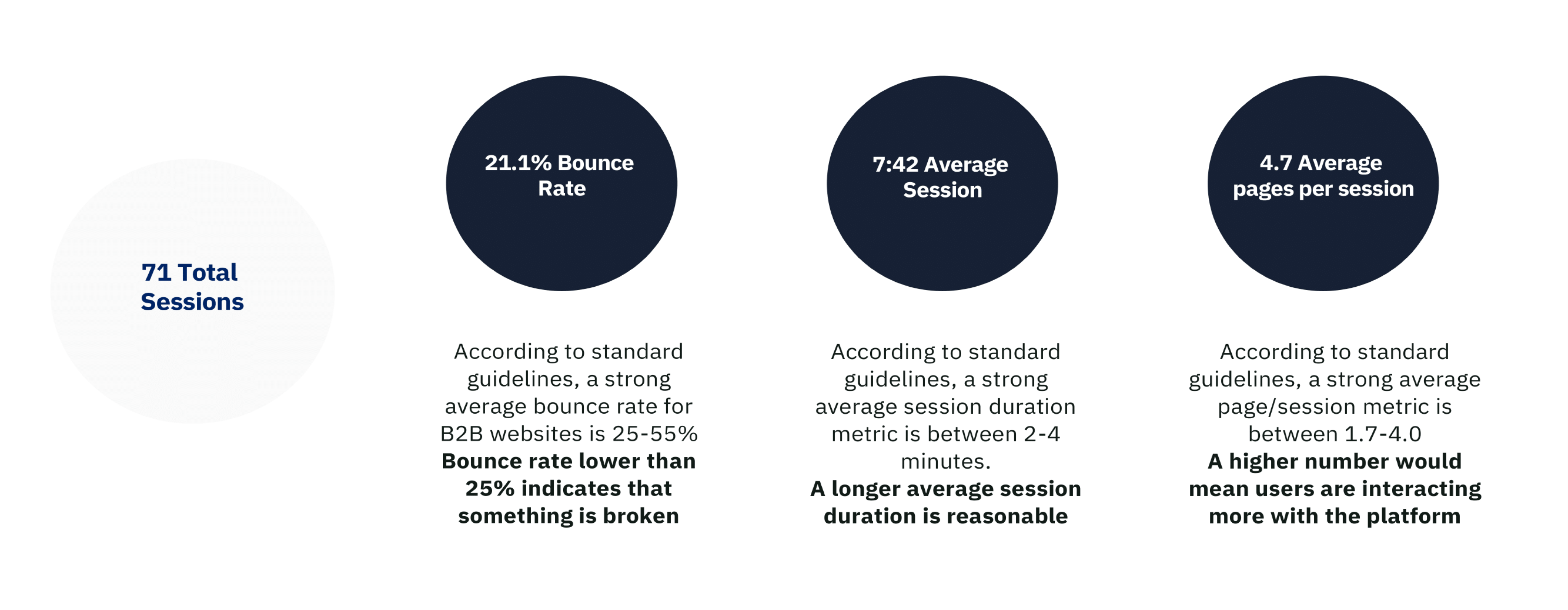
Thorough analysis of rival platforms highlighted BIDDA's strengths and opportunities, including ease of use, transparency, and mobile optimization. This shaped strategic product positioning.


Research provided a clear mandate to focus on driving engagement through the bidding process. This insight guided BIDDA's information architecture and feature set.
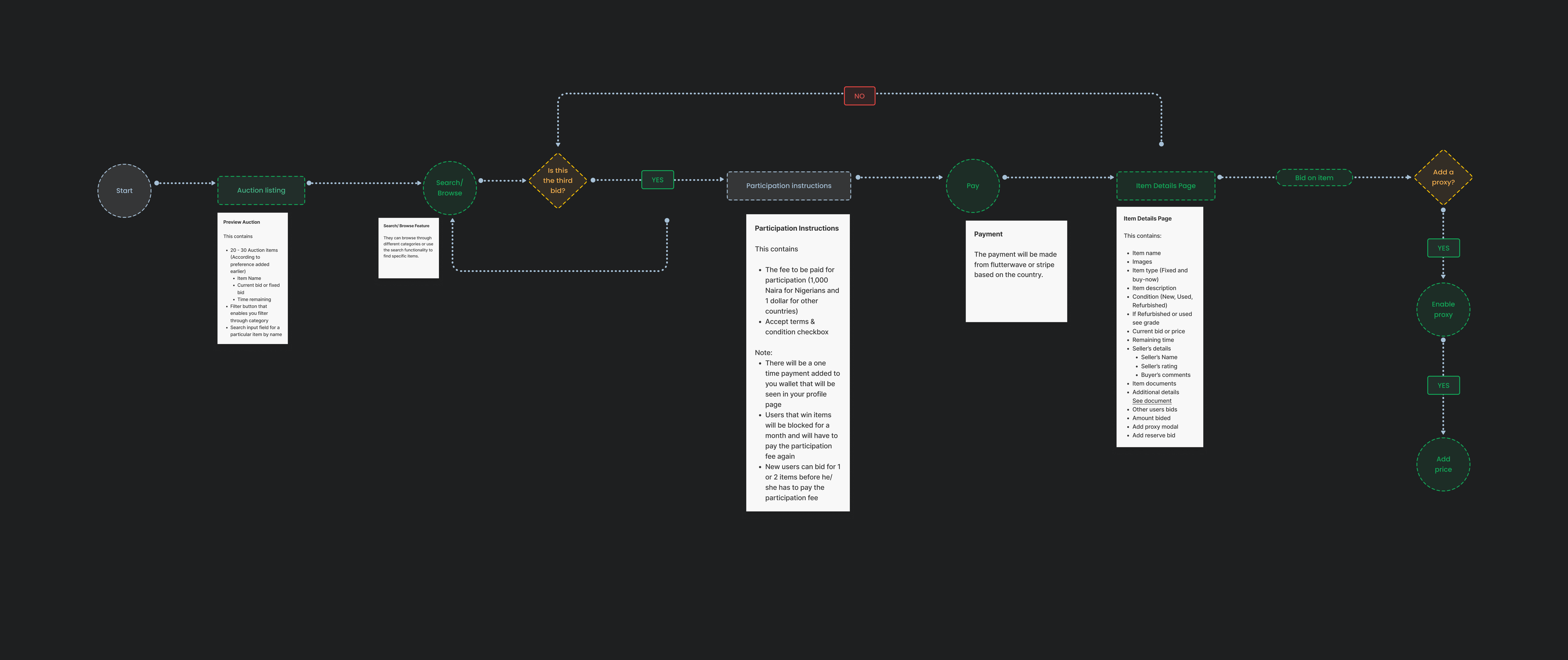
By modeling theoretical user paths to uncover dependencies and identify pain points, the design team was able to shape seamless experiences and devise solutions to ease friction, ensuring that the analysis of end-to-end journeys resulted in logical, cohesive flows.
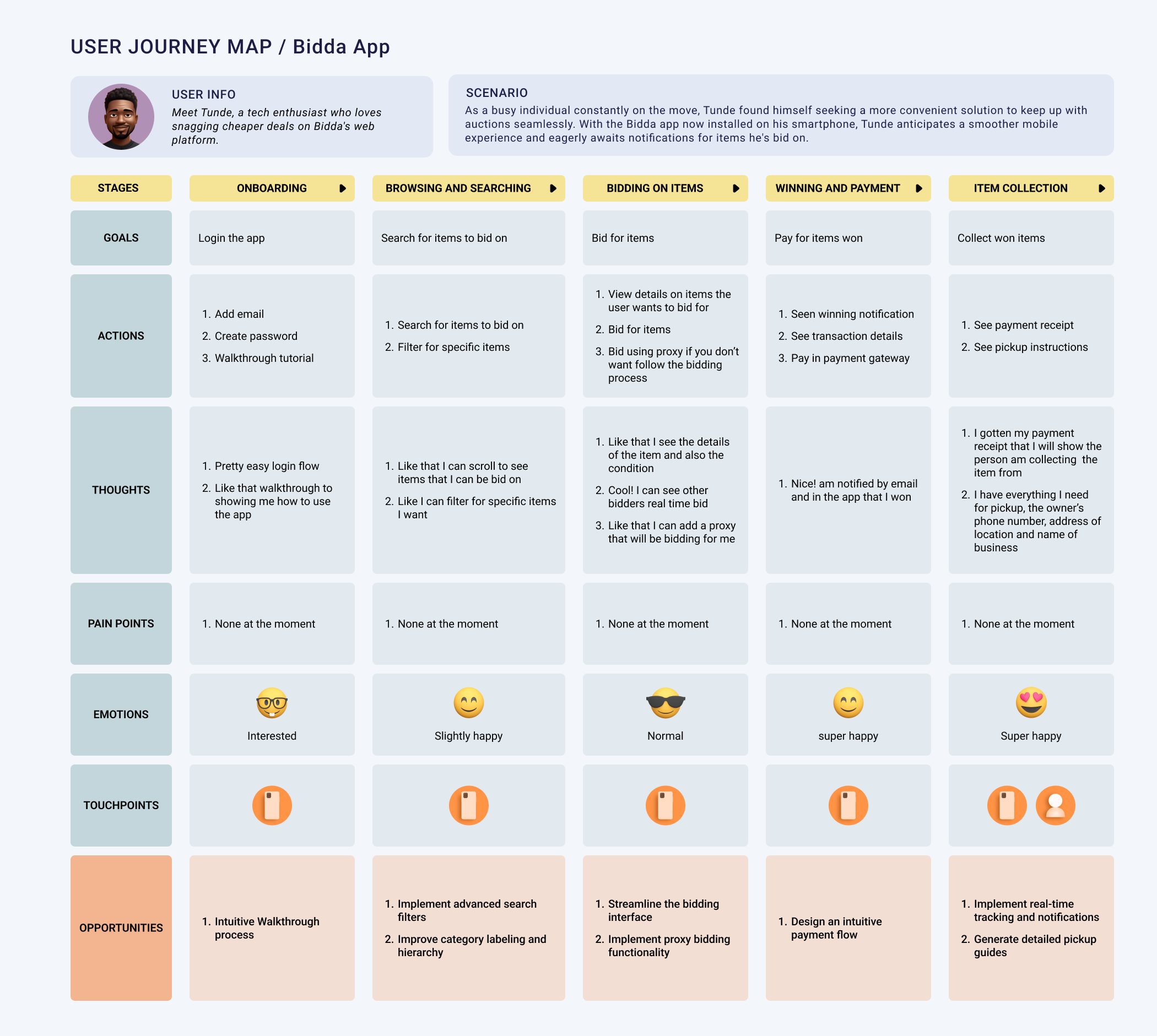
By modeling theoretical uInitially, the Information Architecture (IA) was centered solely around bidding, but user feedback emphasized the necessity for additional features such as account management, notifications, and search. Consequently, we expanded the IA to encompass these user tasks, organizing it by the priority and frequency of actions, thereby crafting an intuitive navigation system tailored for the mobile platform.ser paths to uncover dependencies and identify pain points, the design team was able to shape seamless experiences and devise solutions to ease friction, ensuring that the analysis of end-to-end journeys resulted in logical, cohesive flows.
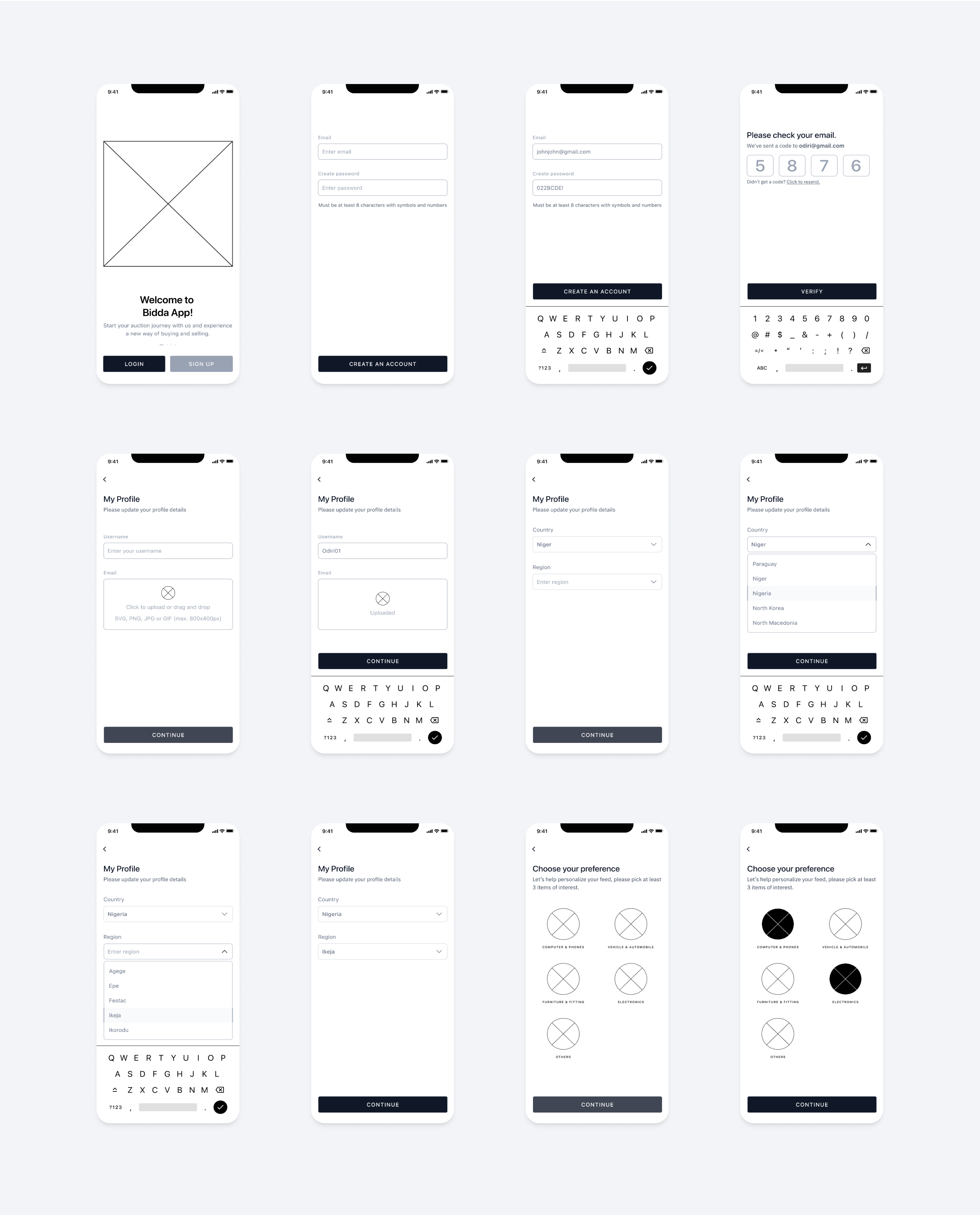
Early in the design process, low-fidelity wireframes were created to map out the basic layouts and flows of the BIDDA app.These black and white sketches depicted the simple building blocks of the user interface and user journeys, without colors, fonts, or other visual design elements.Rapidly iterating on these wireframes enabled quick validation of the information architecture and general usability before additional time was invested in visual design.Feedback from initial user tests of the lo-fi prototypes provided valuable direction on refinements to improve findability and streamline flows.
Optimized IA combined with a consistent UI creates familiarity. Users instinctively know how to navigate and access key functions. All flows were constructed based on observation of beta users performing realistic tasks. Feedback finessed pain points.
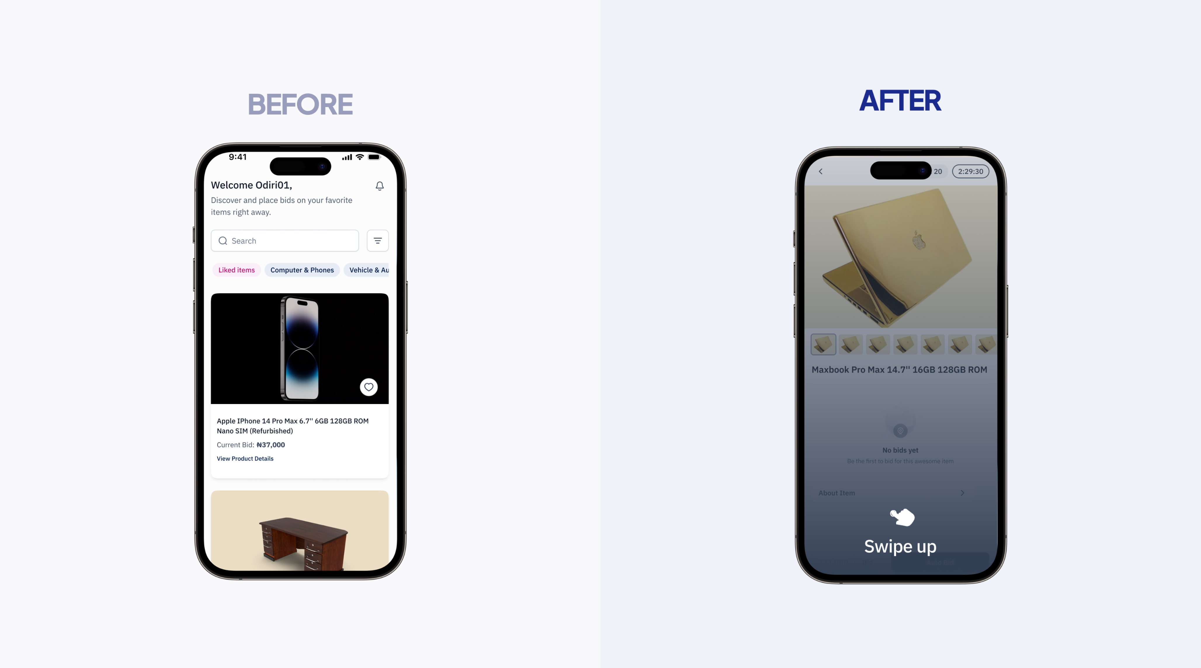
We first had a basic grid view of auction items. To boost engagement, we introduced an TikTok-style scrolling feed where users swipe up to discover new items. This gamified browsing to promote interaction.
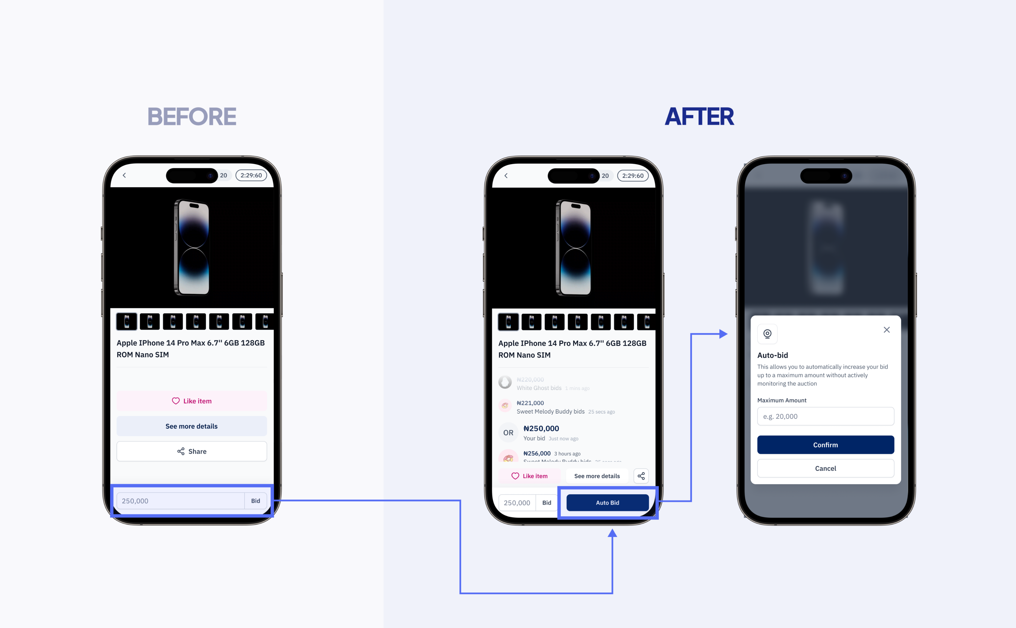
Originally users had to manually enter bids. We implemented auto-bidding where users simply set a max bid and our technology handles incrementally bidding up to that amount on their behalf. This reduced friction and ensured users don't miss out.
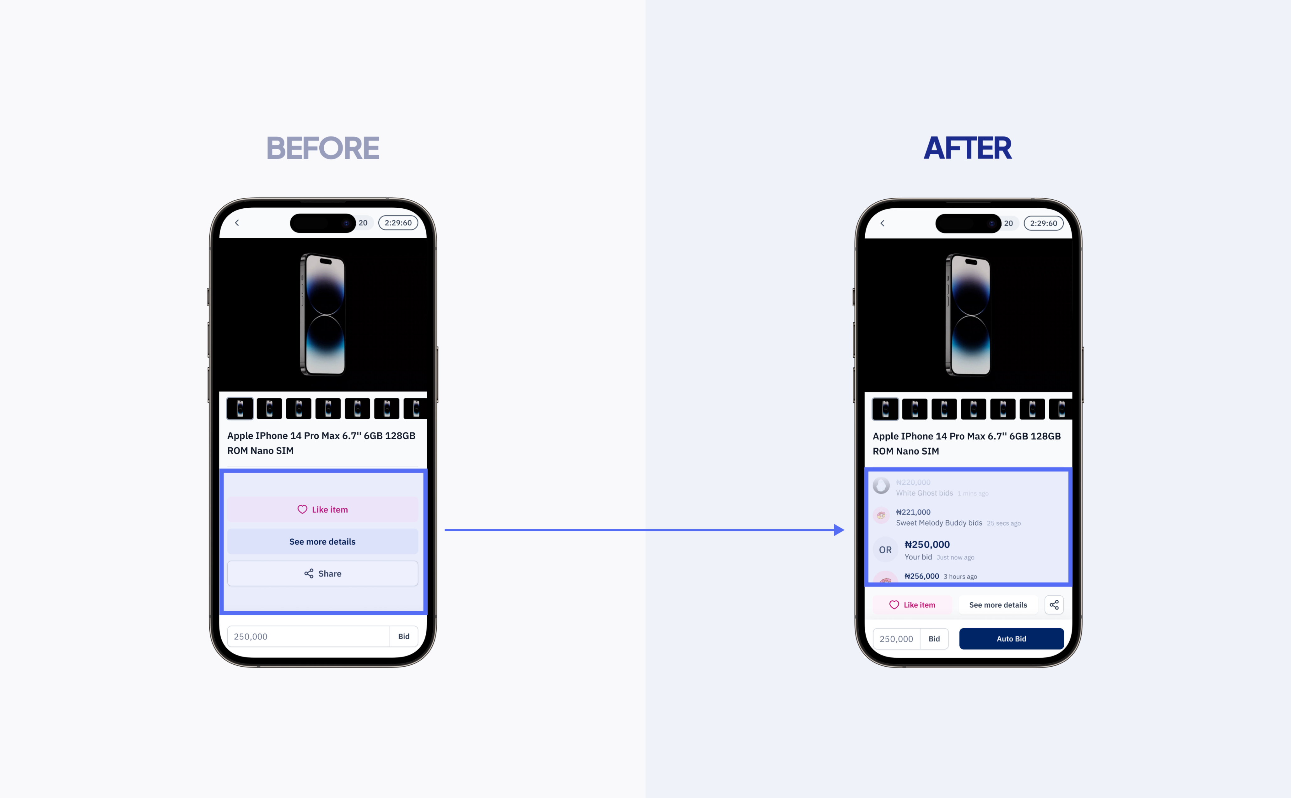
Initially, bidding activity from other users was hidden. For full transparency, we displayed real-time bid status, countdowns, and bid amounts. Watching the action unfold encouraged participation and competition.
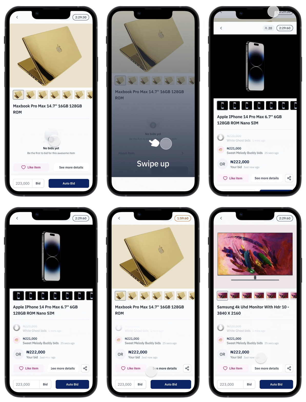
With a focus on driving user engagement, the BIDDA solution was thoughtfully designed to make the bidding and auction process highly intuitive and satisfying.
This engaging feed format enabled users to quickly browse and discover auction items. The addictive, gamified scrolling increased time spent browsing and promoted engagement.
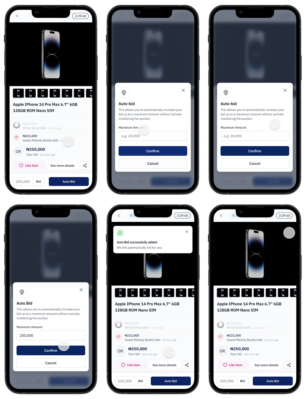
The auto-bid feature enabled seamless bidding by allowing users to set a max bid amount. This reduced bid management effort and ensured users didn't miss out.
Seeing current bid status and activity in real-time triggered competition and incentivized participation. This transparency further drove engagement through the bidding process.
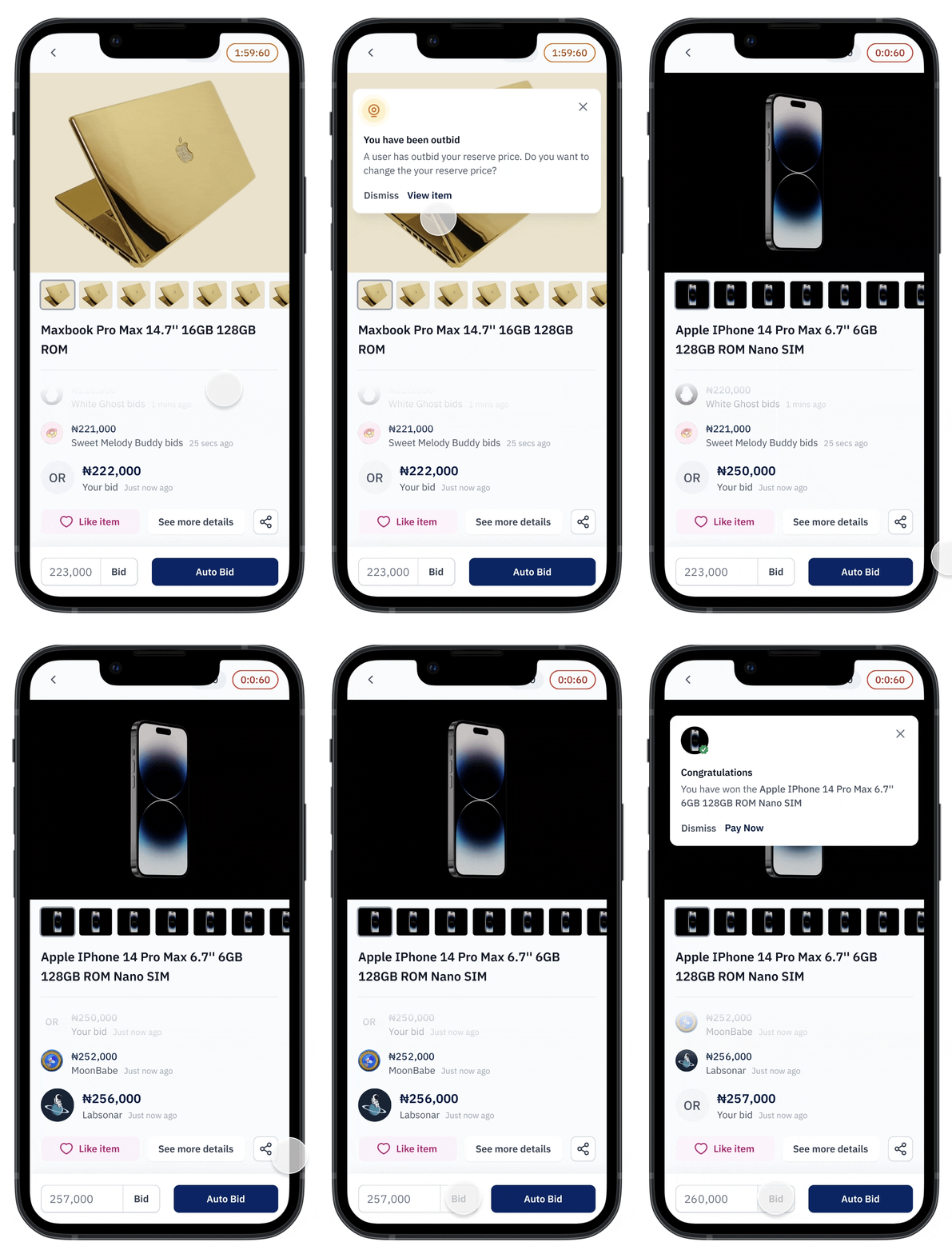
Strong traction and engagement resulted in exponential platform growth, fulfilling the goal of establishing BIDDA as the premier auction solution.

Measured BIDDA's success through key metrics and user feedback, capturing the app's positive impact and effectiveness.
Post-launch, BIDDA's success was evident in its user engagement and download numbers, indicating a strong market fit and a positive user reception.
Users expressed satisfaction, particularly appreciating BIDDA's ability to provide valuable deals and a streamlined bidding process. Their engagement and feedback were testament to the app's impact and effectiveness.
The project was a profound learning experience, emphasizing the importance of user-centric design and the impact of iterative testing on creating intuitive user flows.
BIDDA is poised for continued growth, with plans for new features and updates to keep the platform at the forefront of the asset auction industry.
Staying ahead of technological and market trends is a priority for BIDDA, ensuring it continues to meet evolving user needs and preferences.