Cart


Rayda Core helps businesses track their assets efficiently. However, confusing onboarding processes and unclear labels made users depend more on the sales team. Based on user feedback, we needed to figure out and improve these issues for a better experience.


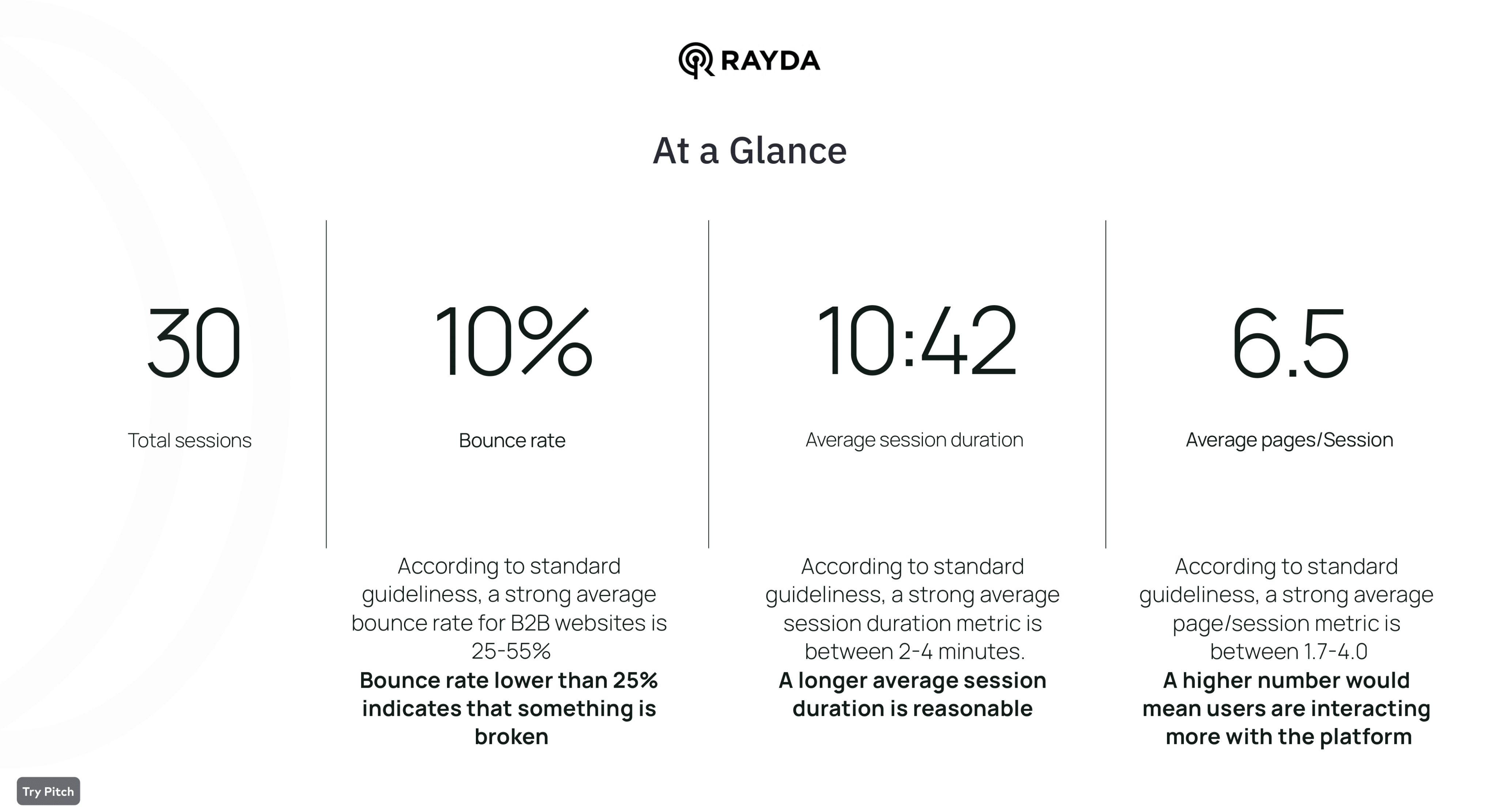
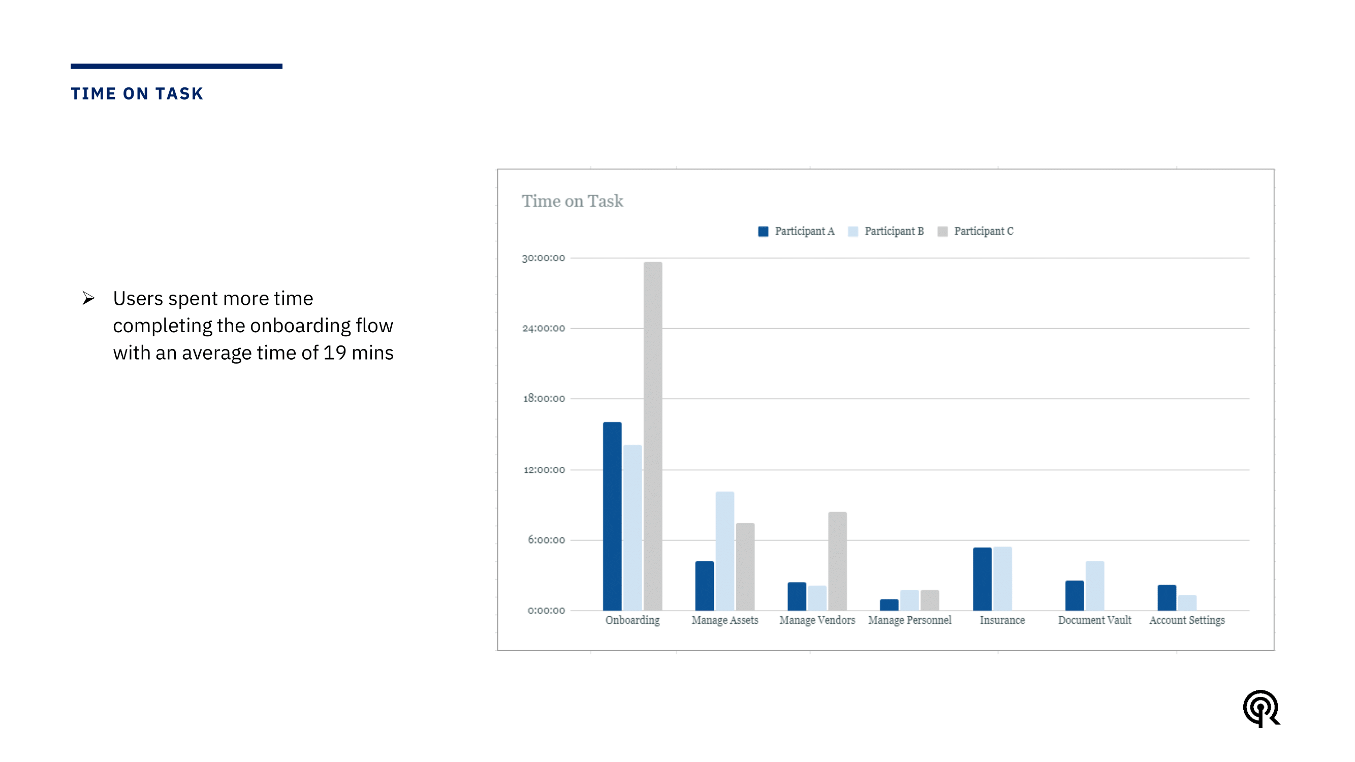
Examining three months of behavioral data revealed low bounce rates (below 25%), prolonged onboarding times (19 min avg), and sporadic engagement (2-3 days/month) which pointed to opportunities to streamline flows, improve navigation, and increase engagement.
Usability testing with five users identified frustration from confusing onboarding flows, increased assistance needs due to unclear UI labels, and hindrances in task completion due to navigation difficulties which revealed needs for simplifying complex actions, guiding users and enhancing clarity.
The customer journey map visualized existing user paths through Rayda Core's core workflows, synthesizing research to identify pain points like overwhelming inputs and confusing terminology. This enabled pinpointing high-impact areas for redesign focus - streamlining onboarding and simplifying asset management. The map served as a collaborative lens for validating solutions against uncovered frustrations while retaining intuitive existing flows. It kept the user perspective central, guiding transformations from friction areas into delightful experiences.


The research made it clear that we needed to fundamentally rethink and redesign the onboarding journey s to eliminate complexity and confusion, guide users intuitively.
Synthesizing insights from our quantitative analysis, qualitative testing, and competitive benchmarking revealed a few core problem spaces hampering Rayda Core's user experience:


Quantitative data showed prolonged onboarding times averaging 19 minutes and low task completion rates. Usability testing uncovered frustrations around cluttered flows and uncertainty around required steps.It became evident that the onboarding process would benefit from simplification, clarity, and guidance enhancements.
There were opportunities to streamline navigation, use intuitive language, and simplify complex actions within core platform workflows.
By pinpointing specific challenges within onboarding workflows, we could focus our redesign efforts on addressing these pain points through targeted solutions. Our research painted a clear picture of the problems users encountered that needed to be tackled.
Excessive steps like entering phone number and verification code made signup cumbersome. Lack of alternative signup options beyond email/password increased drop downs. No visual indicator of progress through the flow caused uncertainty.
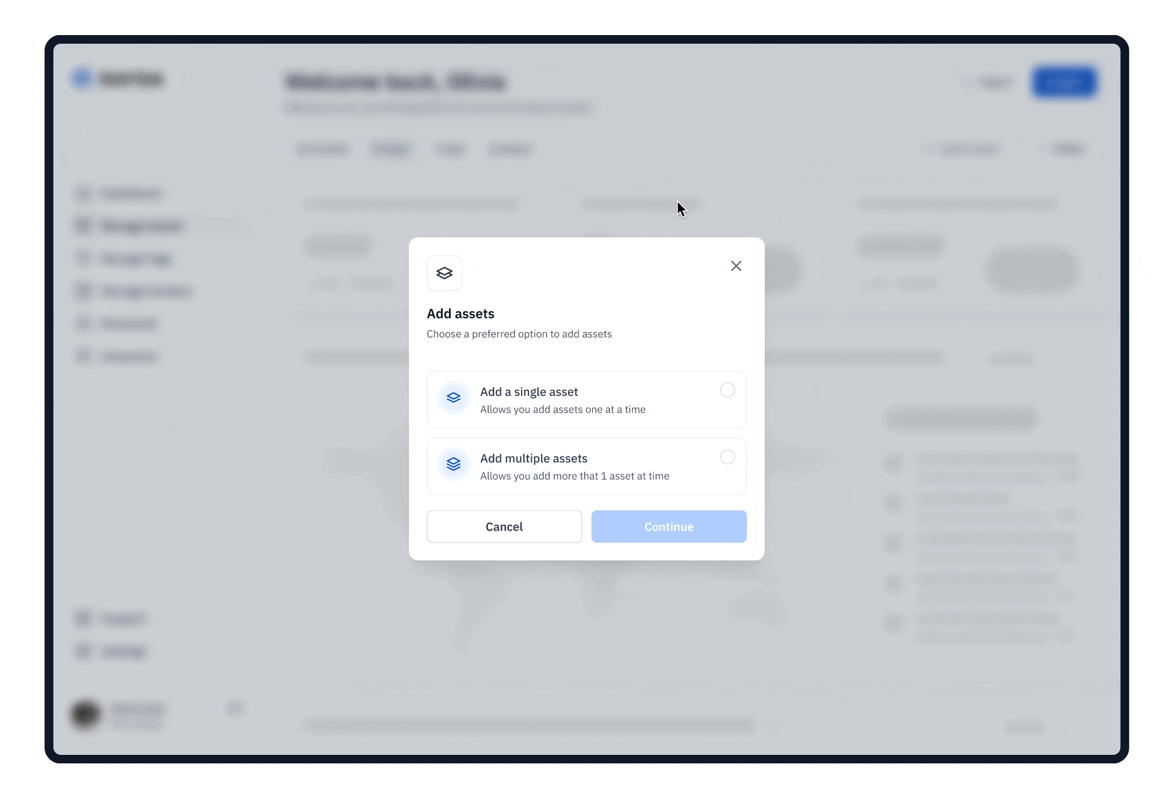
Unclear terminology around "tags" caused confusion on required data. No indications of compulsory fields led to missing information. Limiting users to add only 3 assets initially felt restrictive. Disabled import button with no guidance created blockers.
Central to the redesign was optimizing critical user flows like onboarding, adding assets, and managing assets. Understanding existing pain points allowed us to streamline steps.
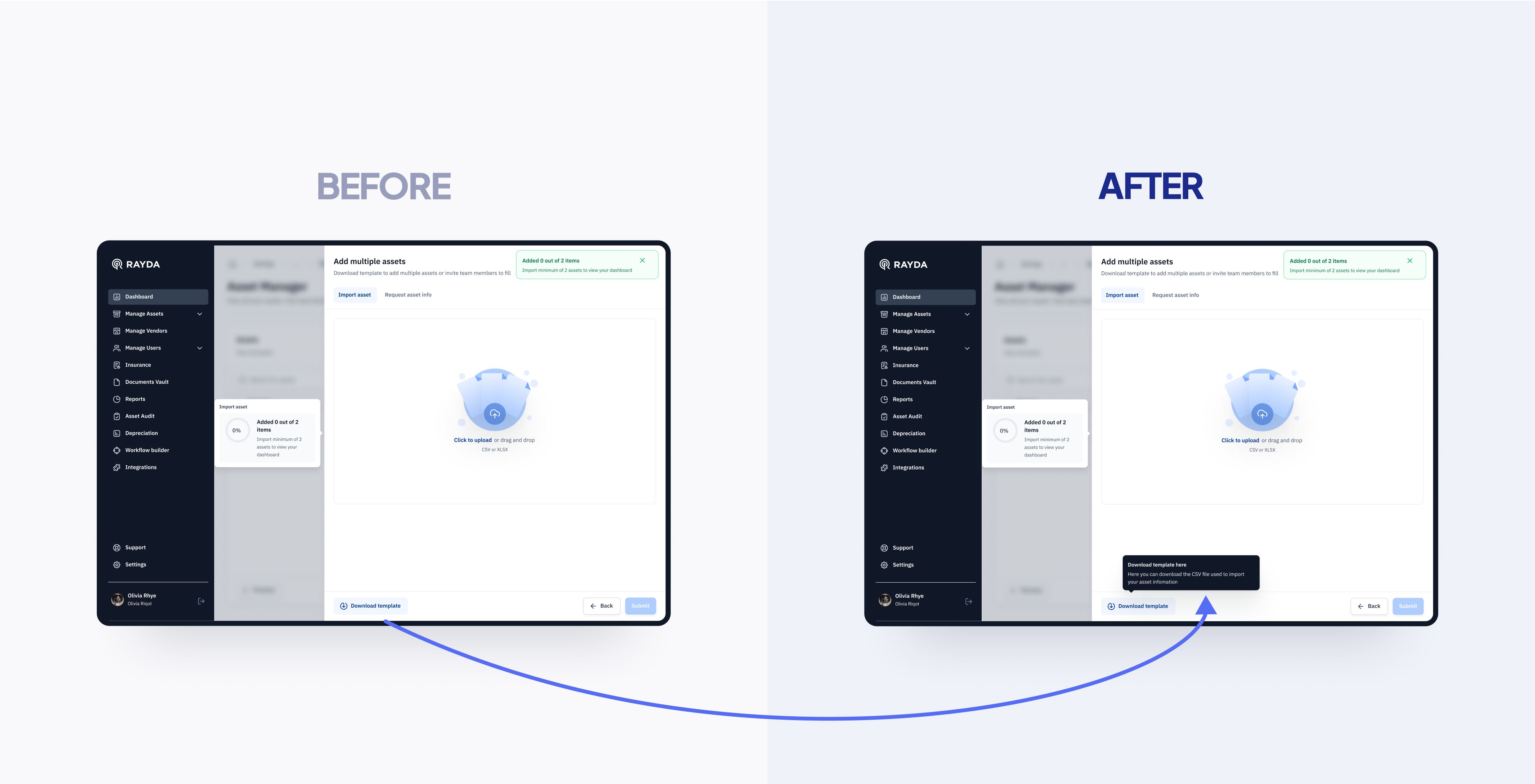
We then developed interactive prototypes in Figma, iterating extensively and conducting a moderated usability studies . Seeing realistic high-fidelity designs come to life allowed users to better assess proposed solutions. Feedback from these sessions directly shaped additions like the download button tooltip and apply to all button.
In usability testing, users misunderstood the "Download Template" button, attempting direct imports. We addressed this by adding a hover tooltip, guiding users to download the template first for required asset data. This iteration crucially resolved user confusion during import tasks.
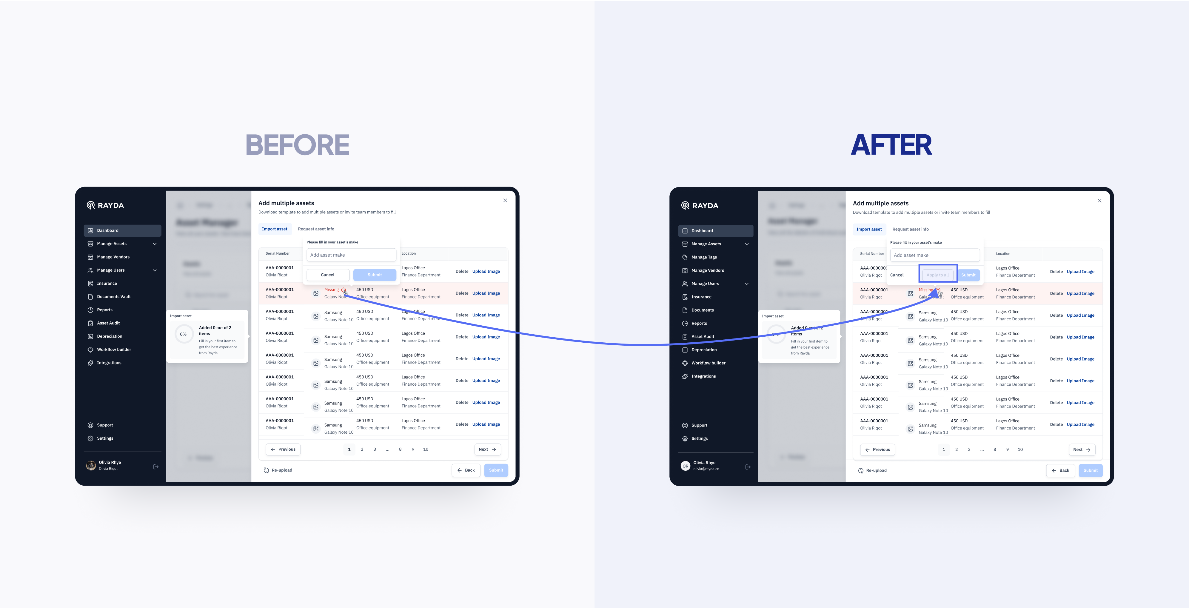
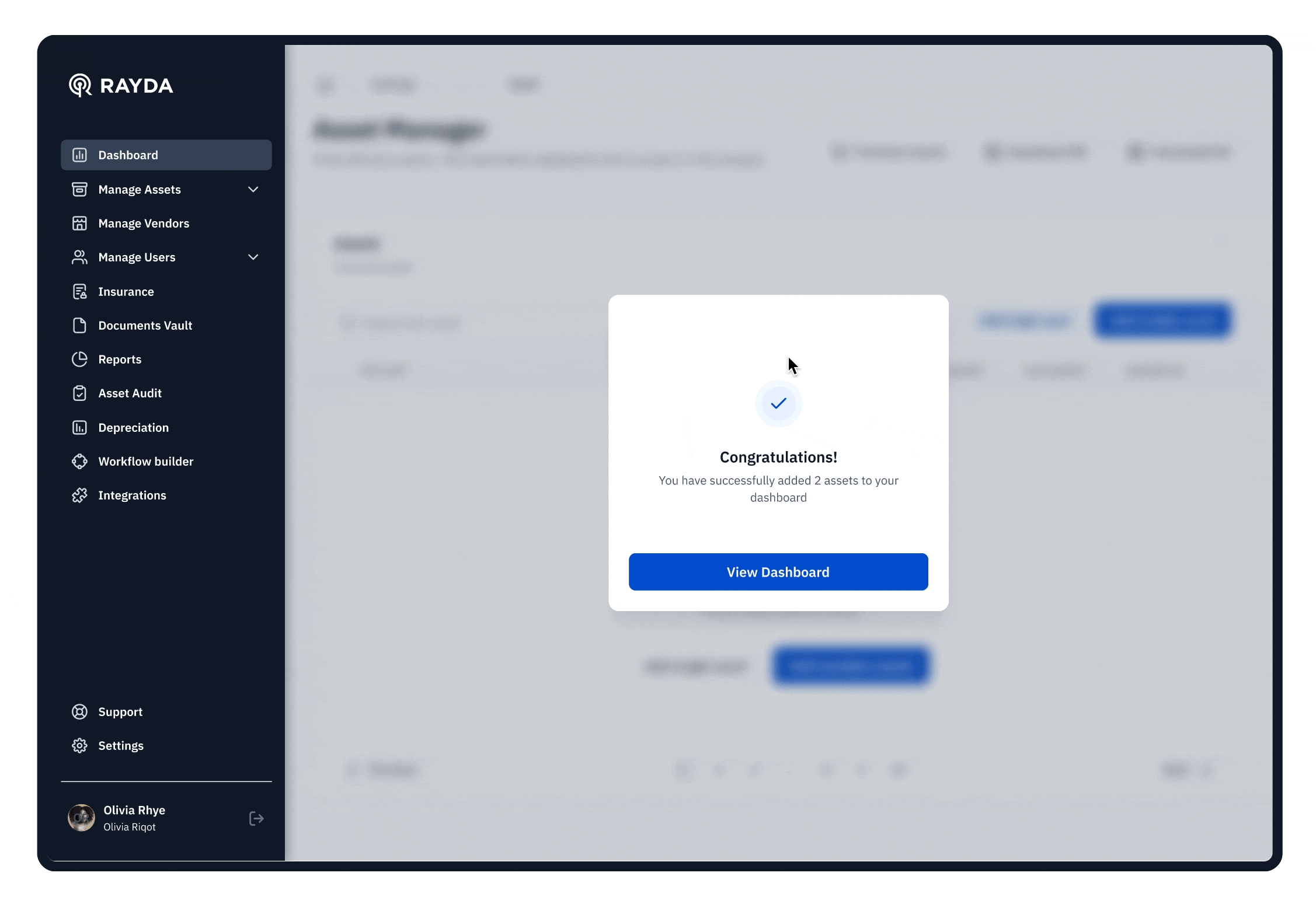
Users sought faster bulk editing for imported assets. We introduced an "Apply to all" button post-editing, streamlining changes across columns with one click. This enhancement responds to feedback seeking efficient bulk edit capabilities.
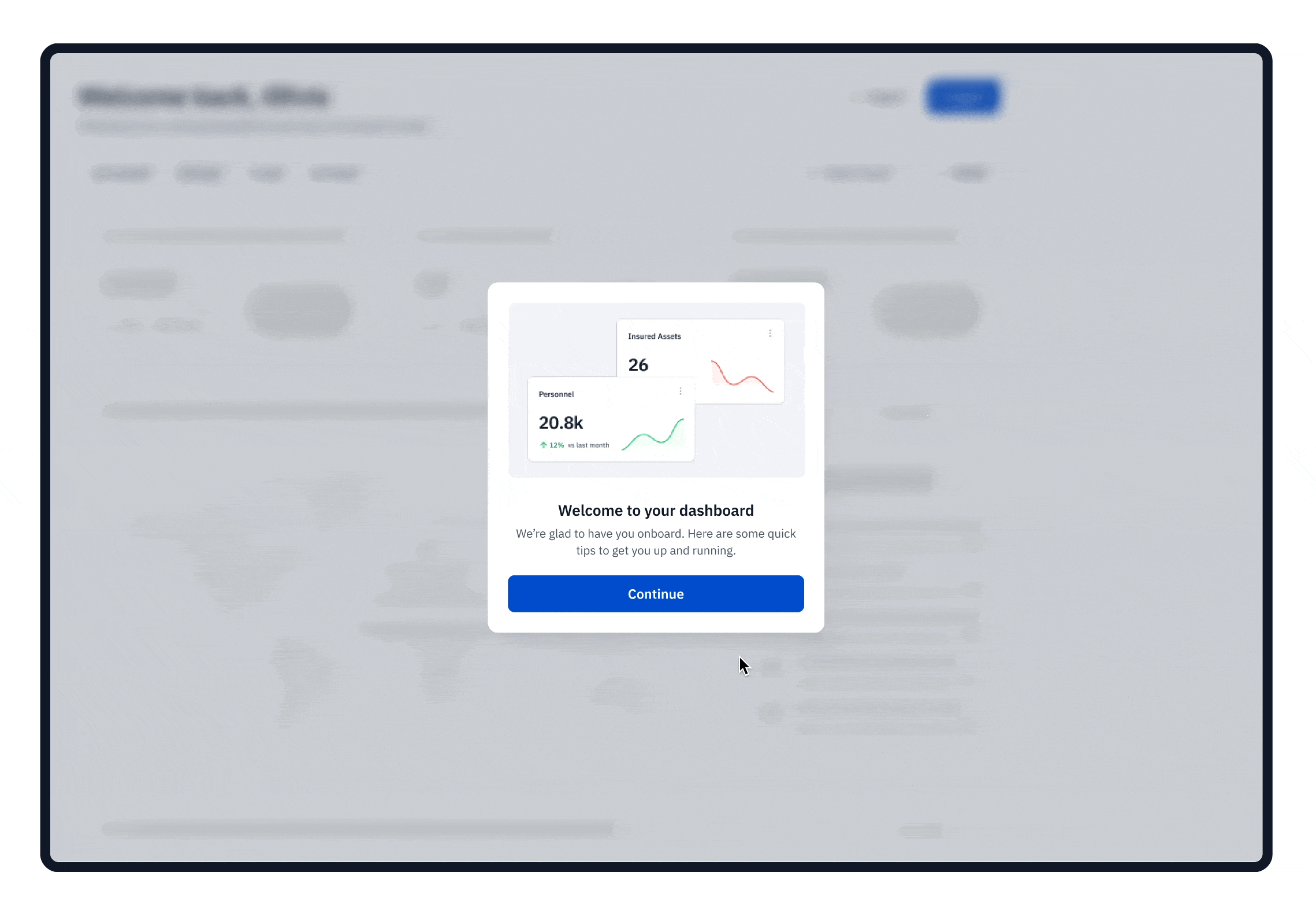
By simplifying the user experience, we aim to increase user adoption and engagement. Smoother onboarding encourages users to explore our platform and become active participants.
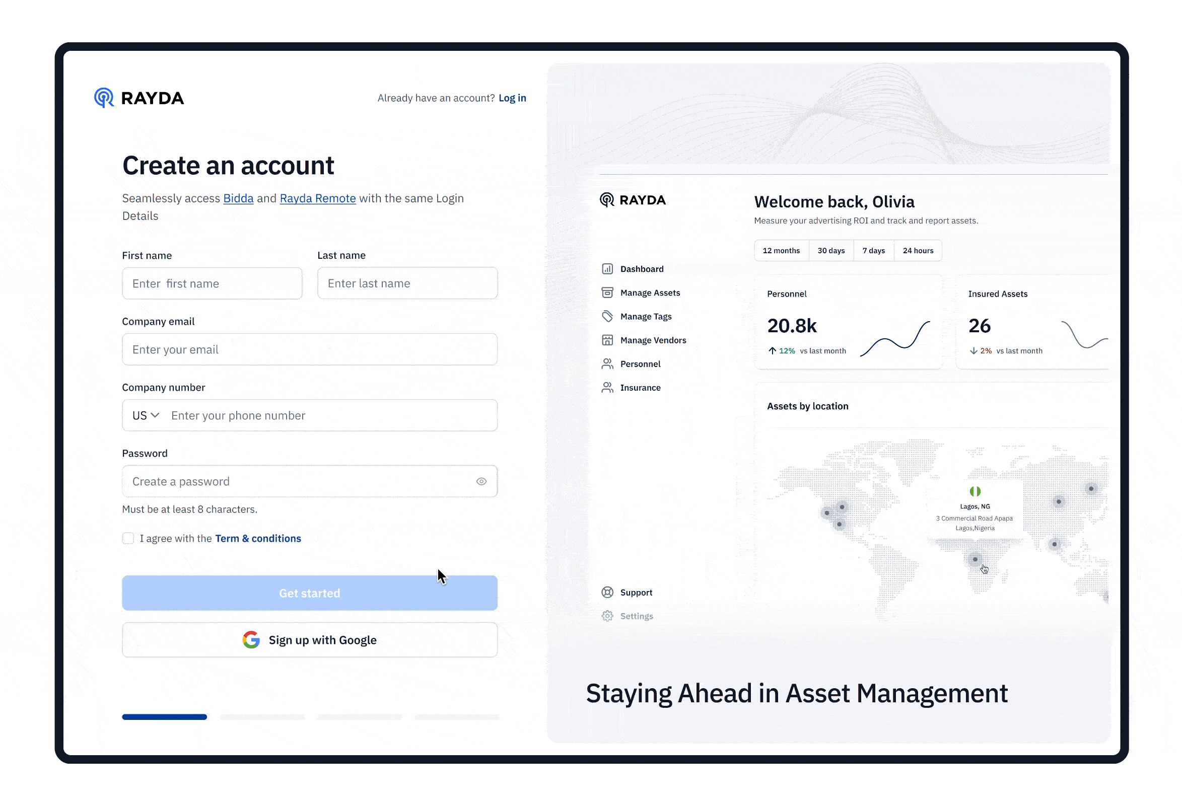
We simplified the signup process by reducing the number of inputs required. Users now only need to provide essential details like email and password to create an account. Alternative signup options via Google or Facebook were introduced as well, preventing drop-offs.
The asset addition process was enhanced to be more intuitive for users. Clear descriptive labels, helpful tooltips, and visual indicators inform users of required fields. Users can now efficiently import multiple assets in bulk, avoiding the need to add one by one.
The data import process was improved by allowing users to preview imported data and identify any errors before final submission. Bulk editing capabilities were introduced as well, enabling quick modifications to all assets rather than editing individually.
To distribute workload, admins can now invite collaborators via email and share signup links with access permissions. This facilitates collaborative onboarding instead of individuals completing all tasks alone.
Improved onboarding process boosts user adoption, engagement, satisfaction, and growth.
Measured BIDDA's success through key metrics and user feedback, capturing the app's positive impact and effectiveness. Our journey towards enhancing the onboarding experience wasn't just about implementing changes; it was an opportunity for continuous learning and improvement.
Post-launch, Rayda Core saw a 50% increase in onboarding completion rates and 38% higher platform retention, validating the success of the redesign.
Users consistently reported the enhanced experience as more intuitive and user-friendly, with reduced complexity and increased clarity.
This undertaking emphasized the immense value of user research for uncovering pain points, and user-centric design focused on simplification and guidance. The project proved the power of reiterative concept testing.
Rayda Core is poised for continuous refinement based on user insights. Expanded tutorials and virtual assistant capabilities are on the roadmap to further optimize usability.
We are watching no-code, AI, and conversational UI trends that may shape future capabilities to drive further self-service and simplify complex actions.